✏️ Urban Sketching (II). Colours
Noticing, depicting and designing colours in the city
📖 The Quote
‘Colour is my day-long obsession, joy and torment.’ — Claude Monet
✏️ The Sketch(es)
Step 1. Go for a walk! (I love starting any sketch like this).
Go to a specific place you like in your town. Bring with you your sketchbook and some basic colours, or your iPad and Procreate.
Step 2. Sit and observe. Notice the colours of the buildings and the urban landscape around you.
Although this exercise would apply to any environment (a village, a rural area or a natural environment) we will focus here on an urban setting.
Step 3. Now pick three of those predominant colours. Draw a matrix of 9 squares and paint these three colours in the middle column.
If you are drawing with Procreate (like I am) you can photograph the scene you’re sketching to directly pick up the colours.
Step 4. Find the lighter and darker colours of these original three and paint them in the matrix. This will form the colour palette you’ll use in the drawings.
Step 5. Sketch!
Draw the place you are at (urban sketching style) constraining yourself to the colour palette you just created.

💡 Some Ideas
This is a good drawing exercise to abstract information using colour.
Depending on the 3 primary colours you chose the information you illustrate would draw attention to different themes: light and shadows, materials, emotional atmosphere, climate… When constraining the colour palette in your practice the results can be truly expansive.
In my example, I chose to illustrate the contrast between the warmth of the earthy materials and the strong evening shadows. But you could also focus, for example on a particular range of monochromatic colours.
We did a similar exercise some weeks ago on abstracting colour (link below). At that time we only used 3 colours instead of a palette of 9. The idea for this exercise is to pick colours close to reality, whereas in the previous one we left the choice of colour to our intention on what to communicate.
Cities are full of colour. We just need to pay more attention.
This is an interesting exercise for artists and designers, and you don’t even need to draw, but just look harder. When you are in a new place or when visiting a city, pay close attention to the colours that build the urban environment you are at and draw that matrix of 3x3 in your mind.
There’s this condition called ‘Colour Synesthesia’ that triggers the experience of colour from a non-coloured input (word, sounds, etc.). When I hear or read the name of a city I have been to, my brain triggers a colour palette from memory: London is dark reds, New York is bright yellow, Valencia is electric blue, Brussels is purple grey, Melbourne is green.
We can reinforce this visual knowledge with a stronger awareness of the colour we live in and train our visual skills with just simply identifying the main colours of the scene as per the exercise above.
🖼 A Building Full of Colour
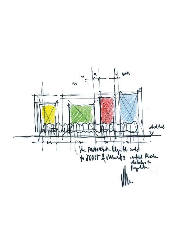
Central St. Giles Court in London (design by Renzo Piano + Fletcher Priest Architects) is a mixed-use development in Central London that brings bold, primary colours to the core of the city.
I won’t go into technical detail to explain the project - I will just say it’s an exemplar building, sensibly integrated in the city, amazingly designed. But will make a note on the use of colour.
On the outside, the use of bold colours bring the scale of the big block down to a set of different facades, with the impression that they are different buildings next to each other. On the inside, the space is unified with the use of the same grey tone, that gives continuity to the interior facade and square. This grey colour brings the interior facade to an almost background place, some days blurring with London’s grey sky (which is the very same colour) and framing the views to the street from the inside-out.
The resulting aerial photograph is striking: the building bringing in brightness and colour to the surrounding neutral environment. The sketch below from the architects is also fantastic: just a few marks to convey the idea of the broken facade, the different colours and the continuity of the ground floor.
Let’s fill cities with more colour! (both in our sketchbooks and designs)
💫✏️
Happy sketching!
Ana
Have you been sketching this week? It would be great to hear about it! Please, leave a comment and share your thoughts down below :)


I love the exercise you have shared to help us notice the environment and the moment we are in more intentionally. Thanks! :)