

📝 Line by Line
📝 Line by Line
Five visual tools from a great artist

“Robinson’s work is a most corageous act of love. He gives the city back to us, line by line, after and obsessively successful and exhilarating journey of discovery.” — Matteo Pericoli
Every great book has a great foreword. Matteo Pericoli perfectly captures, in a few words, the essence of the process of drawing in the preface to a terrific book I found (again) wandering Auckland’s public library. The book is called New York Line by Line: From Broadway to the Battery, a collection of delightful drawings of New York City by German illustrator Werner Kruse, known as Robinson.
Robinson’s book made me think about how we internalise the cities we inhabit, but also all we can discover about them when we put them pen to paper.
Drawing is the act of seeing. Line by line, Robinson draws his particular New York, captivating drawings that tell the story of an emblematic city in lines and patterns.
There are five visual tools in the book the artist uses to make his drawings more powerful. We can all learn from these:
Line
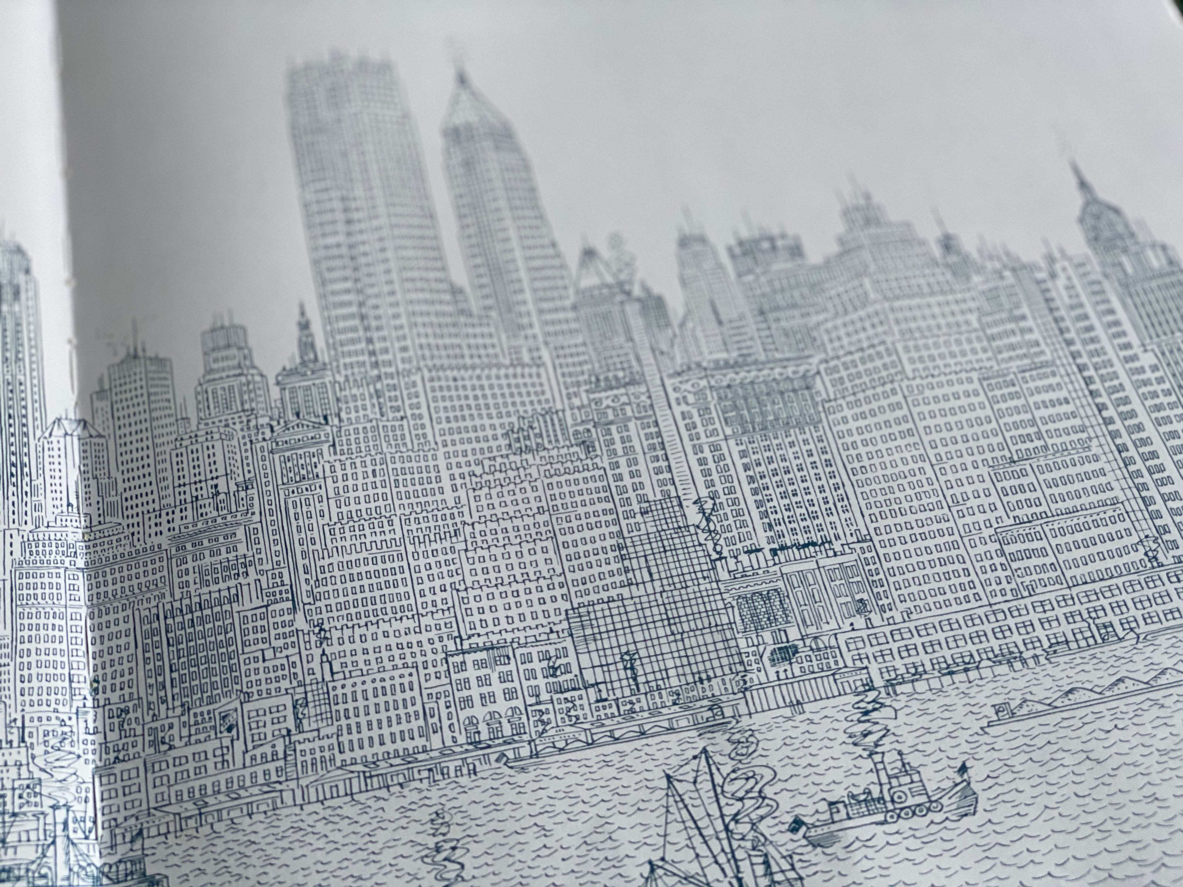
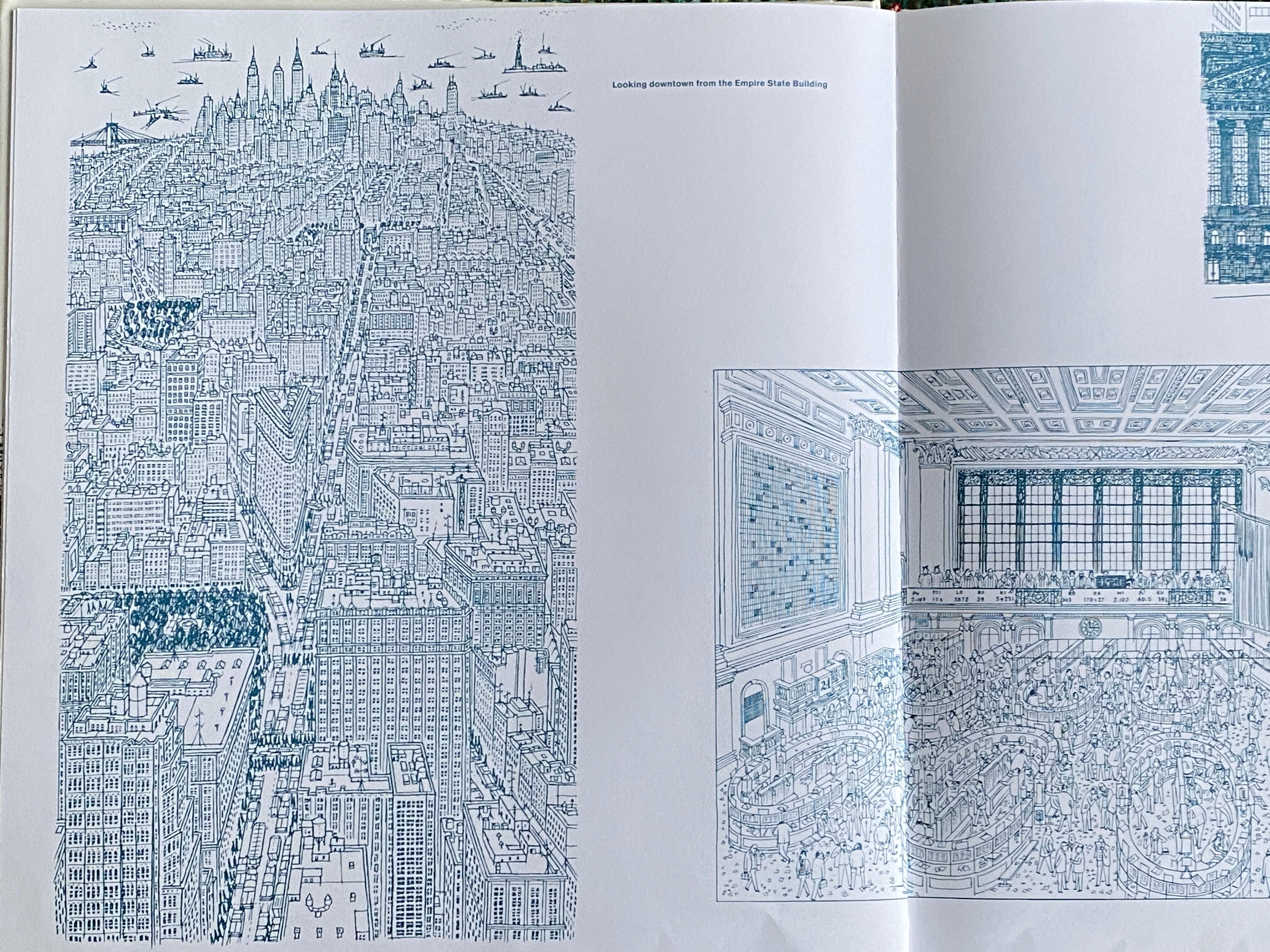
“A line isn’t just a line. Lines don’t exist in reality. And out of a million of options (…) a line is ultimately placed where the artist chooses. It’s a creative process, one that doesn’t aim at representing reality per se, but one that wants to tell it.” Pericoli starts the foreword of the book with this powerful statement. Robinson chooses his lines carefully: edges and windows. New York is windows. Perhaps every city is, and they can all be read from the outline of its openings. Those frames converge the two urban realities: the intimacy of the home and the landscape of the city.
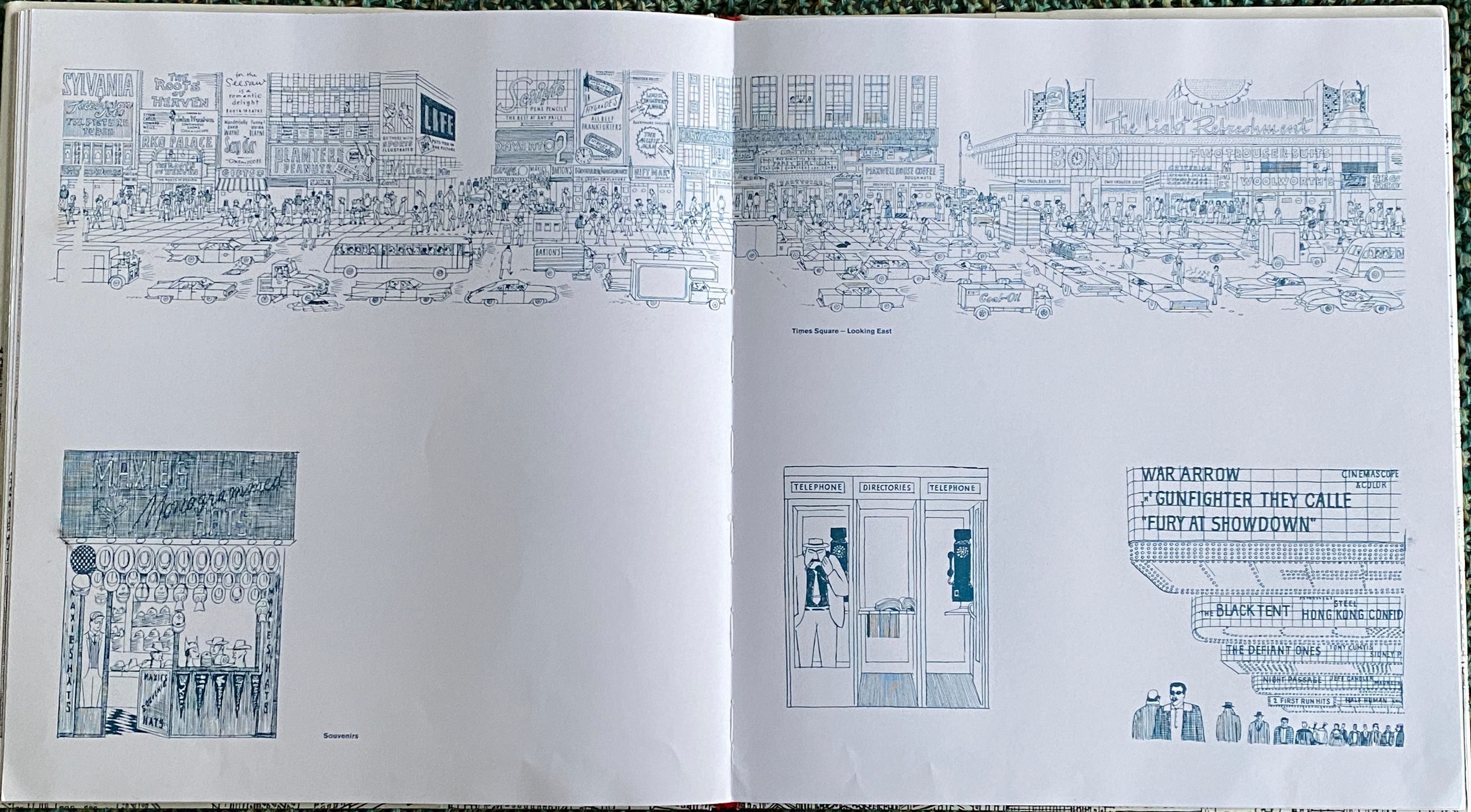
Robinson’s lines strengthen the abstraction of the space. When he draws the interior of a public building, in essence, it looks like a city on its own. The scale has changed, but the elements remain: repetition, patterns, openings, mobile elements (people or cars), etc.
Monochrome
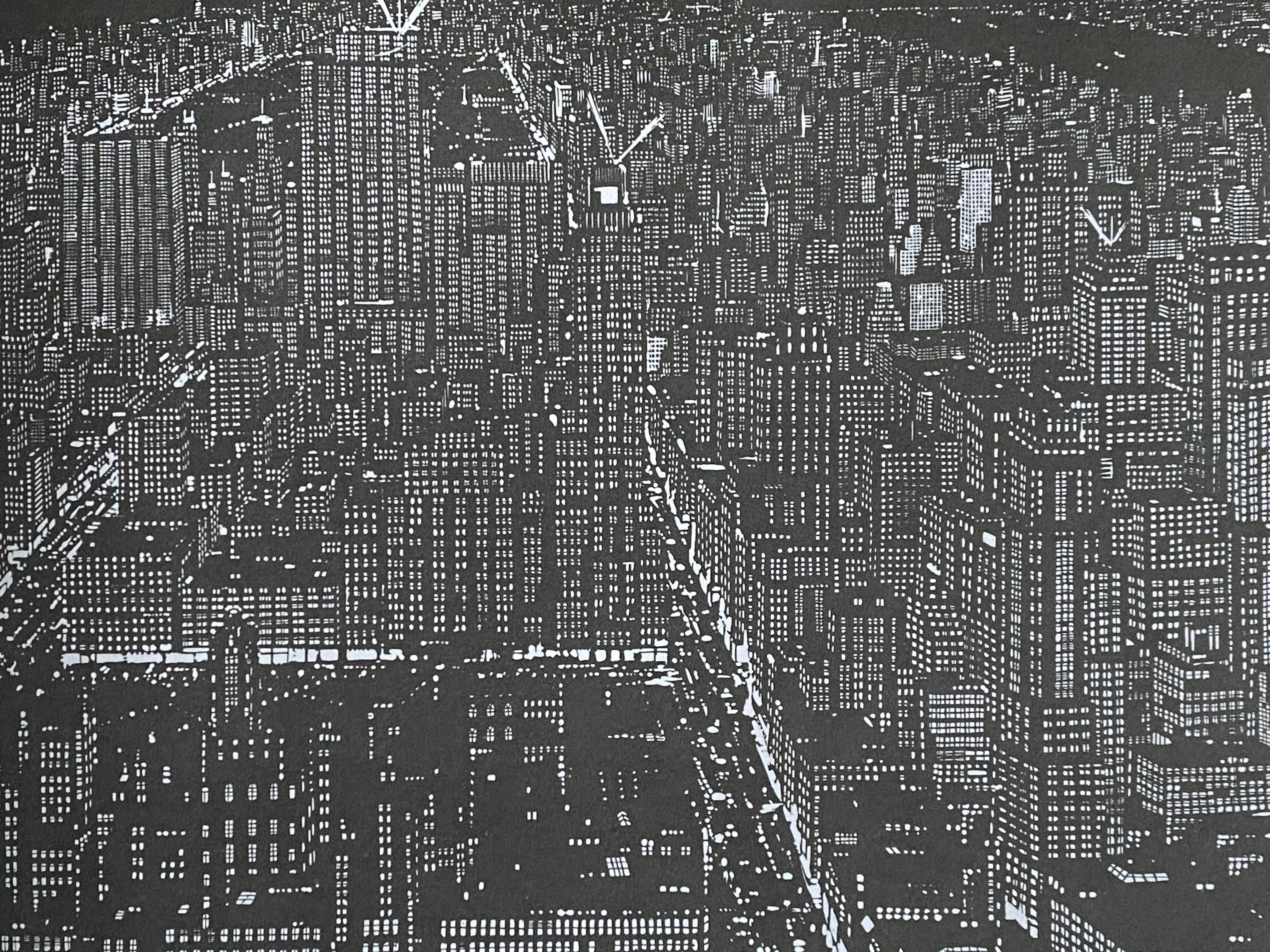
The use of monochrome lines is another powerful abstraction tool. It helps the eye read the drawing in a continuous way and strengthens the message Robinson conveys about New York: the infinite sameness of the city. Robinson uses muted blue and red alongside black ink and grey pencil. In night drawings, the hues are inverted: the sky and buildings are black, while the openings remain blank. The edges have disappeared. Only tone and patterns highlight elements in each drawing.
Monochrome drawings or the use of few colors also assist the eye in reading the relevant information and distinguish elements in a composition.
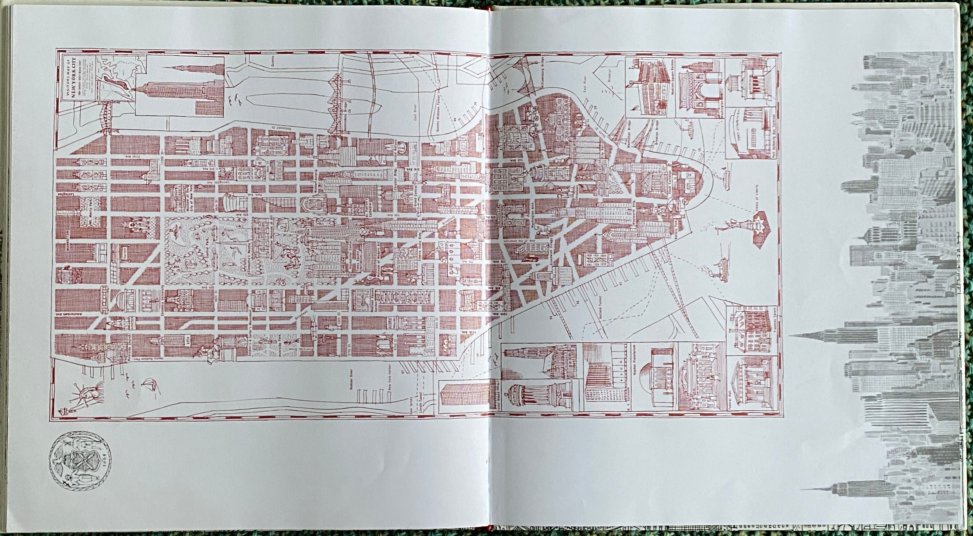
Blank Space
Use blank spaces to enhance your composition - I learned in Architecture School, and so my design sheets were sections and plans loaded with blank spaces that helped read the entire drawing, directing your attention to where the lines where.
Blank spaces, like silence in music or during a speech, are an incredibly important part of the overall composition. Even more so than what we draw, the relationship between lines and shapes, that blank space in between, becomes the foundation of a great drawing. Hokusai and other Japanese artists understood this well. "I'm more interested in the spaces between things rather than the things themselves. Perspective can be limiting in that sense." David Hockney knows how to articulate it.
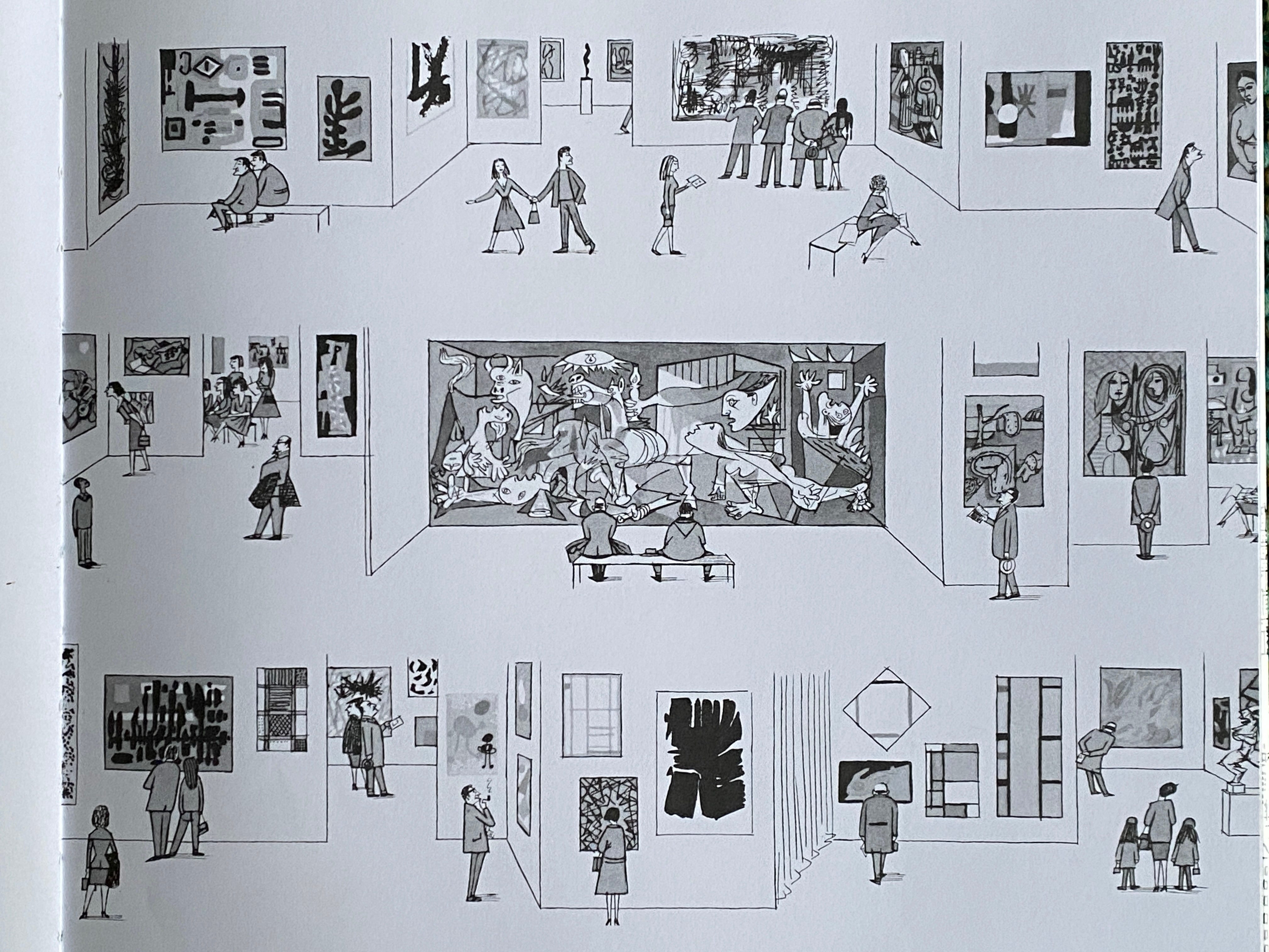
In his book, Robinson presents drawings of New York museums where blank space and a few lines narrate the story of a visit, from the expressionist rooms, through cubism and Guernica in the very center, to Mondrian and modern abstract art. It's a journey through time and space where blank space fills the gaps between all the paintings in this great composition.
Perspective
"The real issue is not what objects look like, but rather how we see them and how we interpret what we see. (…) There is no one correct way to depict reality. Multiple perspectives offer a richer understanding of the world." I always refer back to David Hockney’s theories on the way we see.
Shifting viewpoints tell a better story about what we are looking at than a camera and linear perspective. And this is because our eyes wander around a scene, and our focus changes accordingly. We also tend to see, or rather, perceive, elements bigger than what a camera perspective conveys.
Isometric drawings and sections help us convey a more compelling story than a single viewpoint. Robinson also uses fragments of drawings and blank space to compose scenes.


Detail
"God is in the details", we also learned in Architecture School, a quote attributed to Mies van der Rohe. Notice the attention to detail in most of Robinson’s drawings: the variety of people and cars, along with all the advertisements and texture of the facades that give life to the city. There is something essential in this drawing that brings the scene to life. As if the drawing itself had its own vitality and movement, continously unraveling before our eyes.
What a wonderful find this book has been at Auckland's Public Library, and what a delightful personal discovery of another great artist. I have learned so much from this hidden gem of a book and Robinson's style. I also hope you enjoyed exploring this book with me in this post and found these visual tools helpful in creating better drawings and telling better stories.
✏️✨
Happy sketching!
Ana
You have shown us some very attractive line drawings from the book, Ana. They're fascinating. At a recent conference I attended I learned that way back in sixteenth century France, du Cerceau, an architect and designer, deliberately broke the rules of perspective to produce drawings that made more sense to his clients. I wish I had known this when I was taking my Diploma in Interior Design because I would like to have adapted some of the drawings I had to make!