‘Above all, watch with glittering eyes the whole world around you because the greatest secrets are always hidden in the most unlikely places. Those who don't believe in magic will never find it.’ — Roald Dahl
Last week, I talked about some of my recent Artist Dates in Central London. Today, I would like to expand a bit more on one of them: my recent visit to the Japanese Galleries at The British Museum.
I love anything involving the craft of drawing, but it is particularly Japanese drawings that I find fascinating. There’s something mysterious and appealing about them, not only in their techniques crafted over millennia, but also in the stories they encapsulate and the themes they touch upon, such as nature and everyday life.
Here are a few things I learned during my visit, observing this great collection of drawings:
The mark
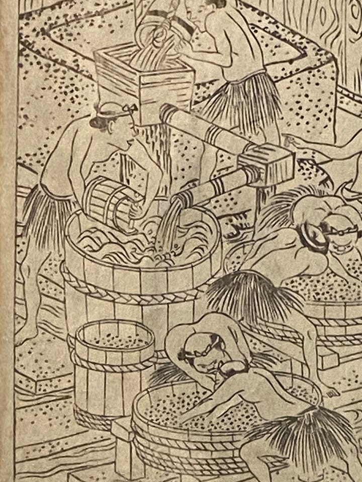
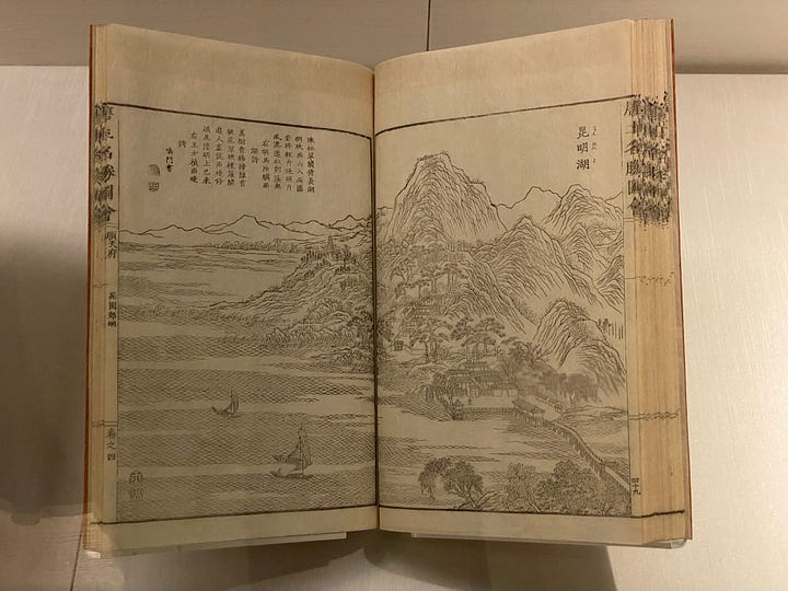
Natural elements are represented through patterns and marks. Flowing water is a bunch of sinuous lines, grains of rice are shown as dots, mountains appear as if carved in the drawing. These marks bring all elements in the drawing to life.


The loose line
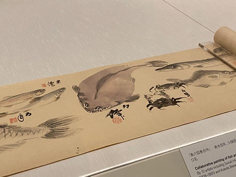
Sometimes the line is incomplete, suggestive, loose, resulting in simple drawings. But simplicity always requires the difficult process of synthesis. Something I always have in mind when I draw or present any graphic information as a designer is to ask the question: am I communicating what I need to with the fewest possible elements in the drawing or presentation? Is there anything redundant?
The loose line makes these drawings so seductive. My teacher in artistic drawing in Architecture School used to say: Hay que sugerir, nunca mostrar. (One must suggest, never show).

The perspective (or the lack of)
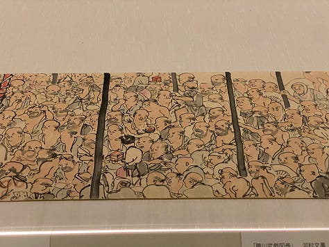
Japanese drawings (and most historic Asian artworks in general) break away from linear perspective to present a composition with shifting viewpoints in which we have access to a broader set of information we wouldn’t see otherwise in 2D.
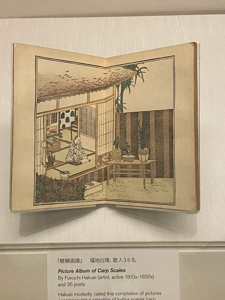
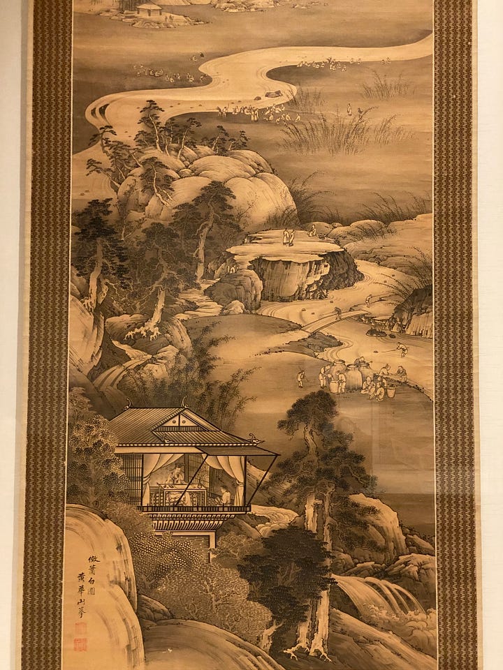
This is a topic very much loved by David Hockney. He explains the effect very clearly in this clip:
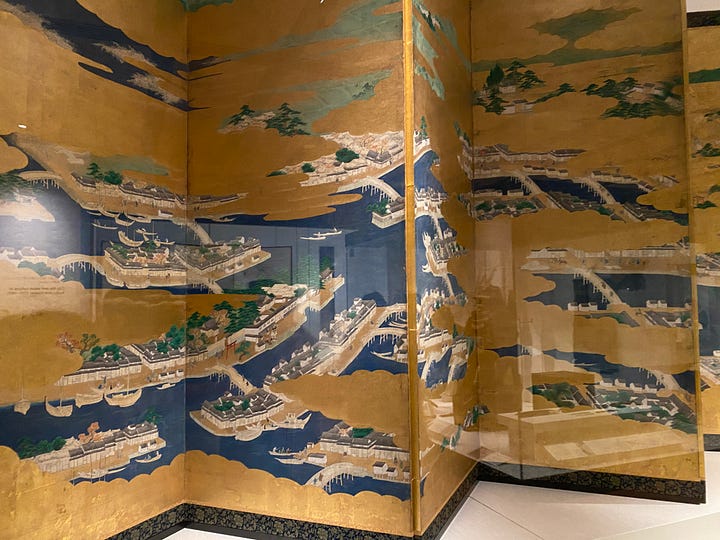
The blank space
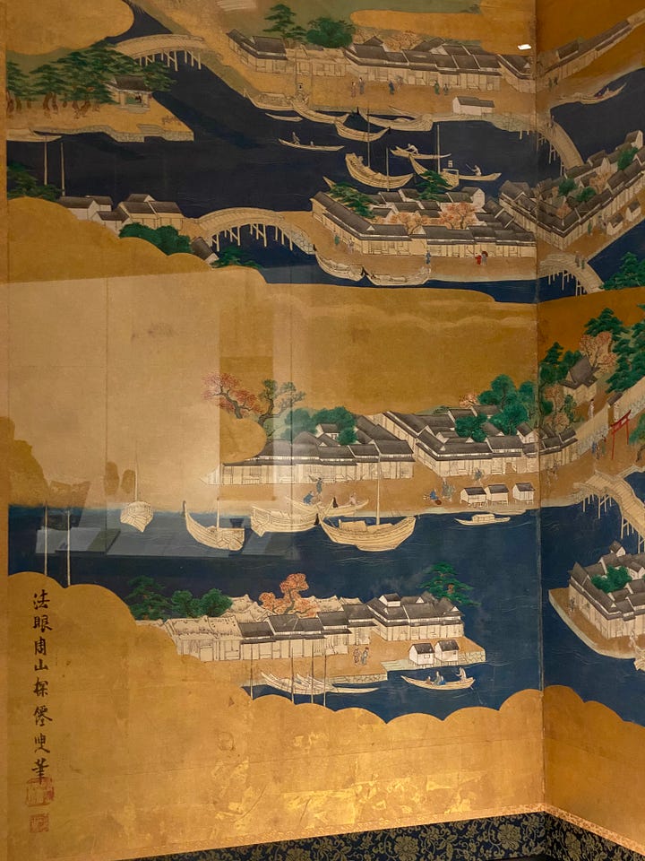
The use of empty space in the composition creates depth and directs focus. In this fabulous artwork, the golden clouds blend with the city streets, framing different moments.
Words and pictures
Japanese calligraphy is beautiful. The lines mix with words, poems, notes… This is another recurring aspect of these drawings. The words occupy some of the blank spaces, completing and framing the image.
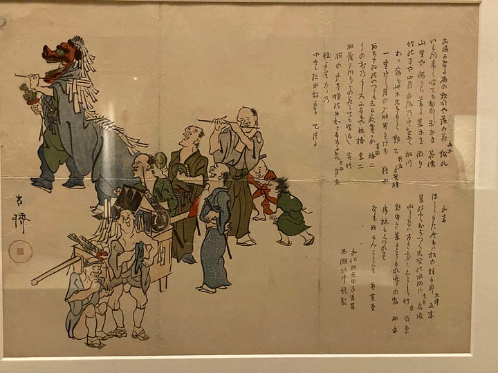
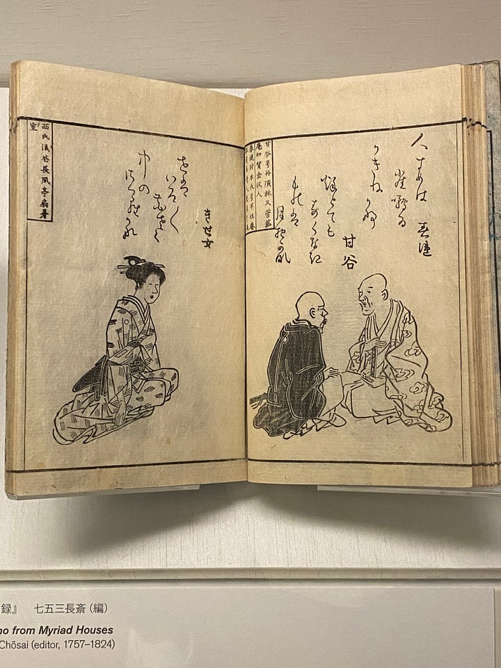
Overall, upon reflection, I believe that it is the balance between all elements in a drawing that makes these Japanese artworks so appealing, but it is also the attention to detail, and the life and energy they encapsulate. They convey the essence of what they represent. They make those scenes so real that we can believe we are just there. They create a truth.
I am not entirely sure how to explain it… but there truly is magic in these drawings.
✏️✨
Happy sketching!
Ana


Thanks Ana, that was a great read that had me enlarging the images on my phone to examine them in greater detail!
What a wonderful article, Ana! There’s so much to learn from these Japanese drawings. I’m definitely planing an artist date for myself to go see some Japanese art soon.