


📝 Drawing, Tone, and Colour
Observations on Van Gogh's drawings

I already tried it [painting] in January, but then I had to stop (…). Now six months have passed which have been entirely devoted to drawing… I have attached great value to drawing and will continue to, because it is the backbone of painting, the skeleton that supports all the rest. — Vincent Van Gogh
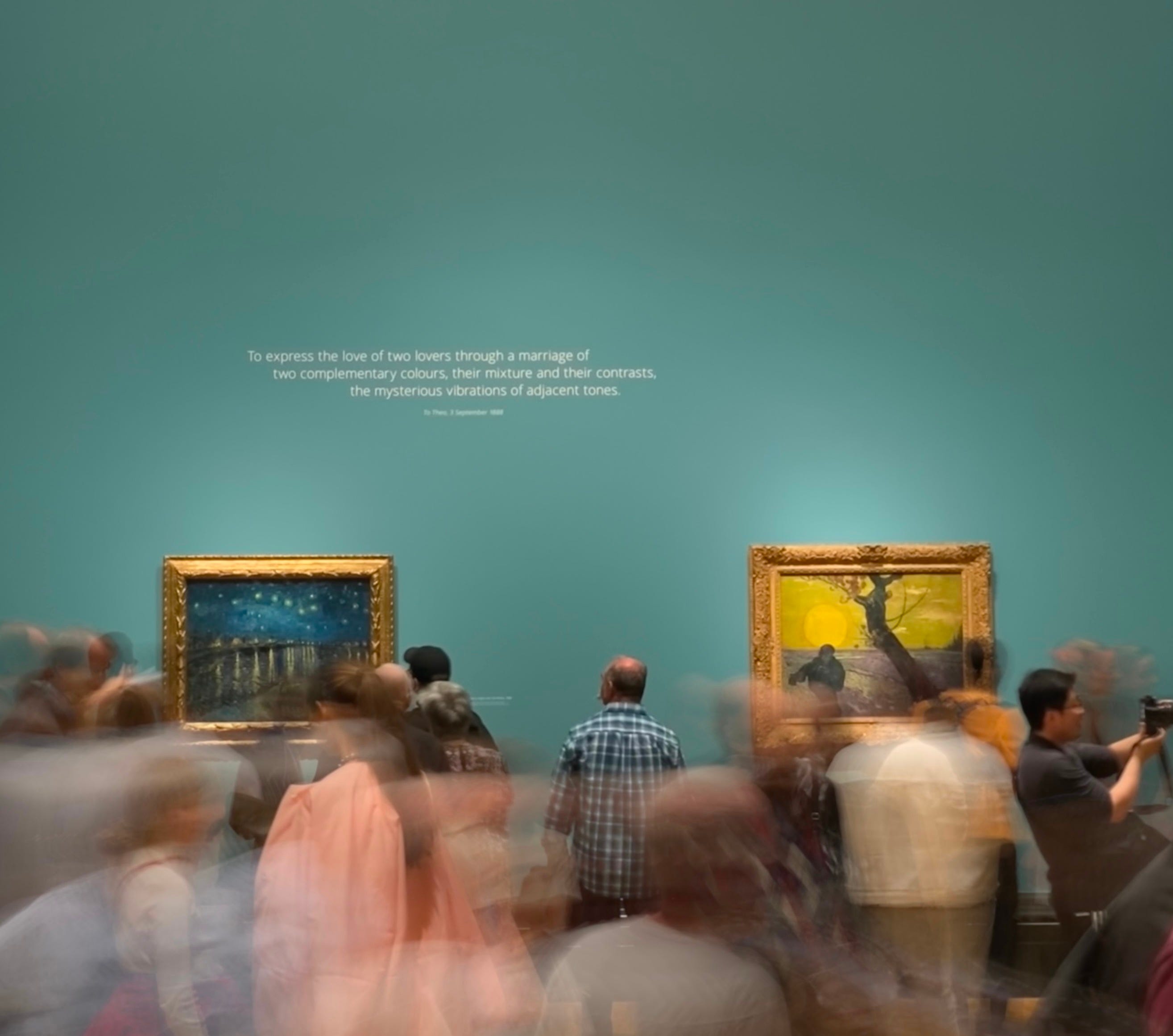
Last September, I visited Poets and Lovers, an exhibition at the National Gallery in London displaying some of the most iconic and memorable artworks that Vincent Van Gogh painted during his final years. Although the exhibition was focused on his paintings, there was a tiny room dedicated to some of his drawings—studies of the scenes he would later transform into colour. Though these were sketches in preparation for another work, these drawings were large pieces, and truly artworks by themselves.
There’s so much to unpack from this visit (and I am fortunate I’ll be visiting again soon!), from all Van Gogh’s work, really, but one of the things that interested me the most was looking closer at how those sketches and drawings inform his paintings, and how they reveal Vincent’s artistic process.
Let’s go into this a bit deeper.
The relationship between painting and drawing is tone.
Period. Colours appear in harmony because of tonal relationships between them and the overall composition. As Betty Edwards puts it in her book Color: A Course in Mastering the Art of Mixing Colors, the value levels of colours are important because dark and light contrasts are fundamental to good composition.
Van Gogh believed, much in line with Edwards’ teachings, that he should master drawing and black-and-white tonal work before going on to attempt colour and painting. The result, after he did so as the quote above reveals, is astonishing: the way he uses and combines colour is truly something remarkable, and something we all admire when looking at his paintings.
In Vincent’s case, there’s something else beyond tone: he also uses the mark, the line in the sketch as brushstrokes, to prepare for the composition of the painting. These lines carry the information of tone as well as movement and style to the painting. The example of the olive tree from the exhibition is very revealing of this whole process. See below how the images compare, from left to right:
The sketch
The painting
The black-and-white photo of the painting


Take a moment to look at these three images, go from left to right and viceversa. When we do so, we learn that much of the tonal information of the painting appears already in the first sketch: the trunk is dark, with some branches growing upwards in the same tone. There is a frame above and below of mid-tones, and a very bright floor framed by it all—this space is left blank in the sketch and later is painted in yellows.
Converting a photograph of the painting to a black-and-white image helps reveal the tone of the composition, allowing us to see an extra layer of information that may not be immediately obvious to a non-trained eye. Then, when comparing it back to the sketch, it can help us identify the tonal similarities between the two.
I only learned about the relationship between tone and colour myself when I took an art course last year in Auckland (New Zealand), with the wonderful Matthew Browne. One of the assignments was to create a painting based on a tonal drawing and truly this process deepened my understanding of the relationship between tone (drawing) and colour (painting).
The first drawing was an abstract expression of tones. We were encouraged to let go and see where the material (charcoal) would take us. I let the charcoal do its thing and I ended up with a composition of beams of light and darkness in all directions.
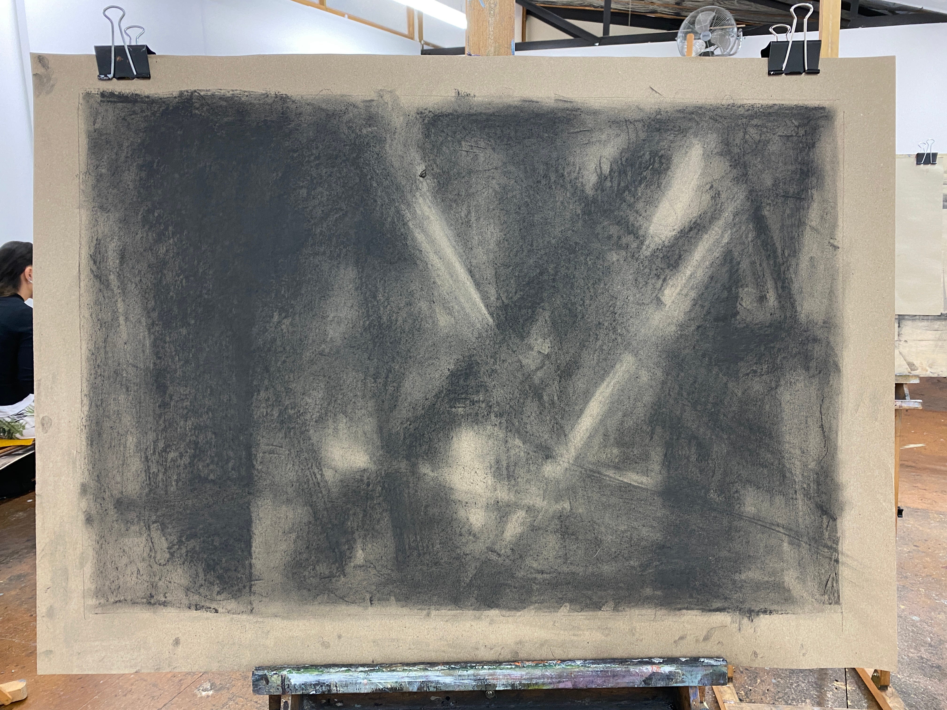
For the second assignment, after learning some basic notions of colours and how to mix them, we were instructed to take the tonal drawing into a painting. We could either take a detail from the composition or attempt to replicate the entire image. I chose the former, and you can see the results below. From left to right:
Charcoal drawing
Painting in complementary colours
Photograph of the painting converted to black and white


Van Gogh wasn’t the only artist who appreciated the need to improve his drawing to be a better painter. Cezanne’s drawings also reveal the quality of the craft as a visual artist, and other more contemporary artists such as David Hockney, also explored the possibilities of drawing in tones. His series of Yorkshire in black and white are just fantastic.
Take this small assignment: try sketching only with tones. If it becomes something difficult to do when seeing in colour, take a photograph with your phone and convert it to a black-and-white image. Do this process of taking a photo and converting it to black and white for those compositions in colour that work to your eye, this is a good trick to be able to start seeing clearer why that works in terms of tone.


If anything, what this process between drawing and painting also reveals, is that great artworks take time—and craft—to produce.
✏️✨
Happy sketching!
Ana
Very interesting to compare the pictures and follow the process.
Great piece! Drawing and painting are all about the same thing: where you put the darks. Getting the values right is vital; the rest is just window dressing.
And that’s such a great exercise. Time to do more black and white drawings, and monochrome paintings.