“But in this world we actually live in, distance ceases to be distance and to be blue when we arrive in it. The far becomes the near, and they are not the same place”. — Rebecca Solnit
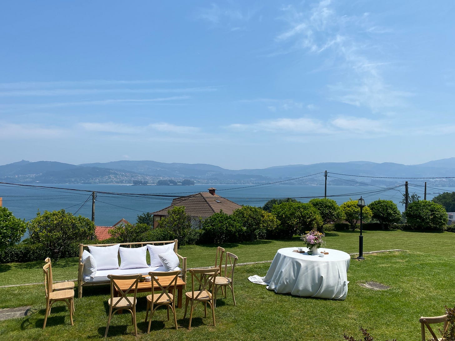
A fond memory from my teenage years that lights up every time I look at a mountain-like landscape in the distance is my dad showing me his painting 20 years ago of a Mediterranean landscape: the distant mountains are blue - he taught me. Apparently, this happens due to a phenomenon called Rayleigh Scattering, and the further the mountains, the bluer the blue.
I remember struggling to see that blue of distance as a child, but I can see it clearly now. Rebecca Solnit has written beautifully about what I can’t articulate in my own words in her book A Field Guide to Getting Lost: “There is no distance in childhood. (…) Their mental landscape is like that of medieval paintings: a foreground full of vivid things and then a wall. The blue of distance comes with time, with the discovery of melancholy, of loss, the texture of longing, of the complexity of the terrain we traverse, and with the years of travel”.

Colour is space. Space is time. And time is emotion. As Rebecca Solnit says, the distance ceases to be blue when we arrive in it. The far becomes the near, and they are not the same place.
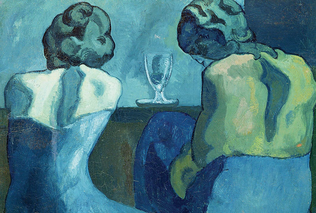
It’s not a coincidence that the character Sadness is blue in Pixar’s fantastic film Inside Out. There is a lot written about colour psychology, but it’s ultimately our personal perception of that colour that gives it one meaning or another. Perhaps blue detaches, putting space between the observer and the thing observed. Picasso, also, had his blue period. In his case, it wasn’t the distant mountains he painted blue - it was distant people.
I find Picasso’s blue period so interesting - the fact also that artists and designers, we all have our phases and seasons. This painting of his is fantastic: the two women drinking in the picture appear abstracted in blues, almost like a landscape, mountain-like.
Reading Solnit’s essay made me reflect on the use of blue in my drawings and my perception of this colour. These are some thoughts (in blue):
There are so many types of blues, the blue of distance is just one of them, and its perception is unique for everyone. Mix a bit of red, and you have a closer, warmer colour. A bit of green, and you get a more vibrant hue.
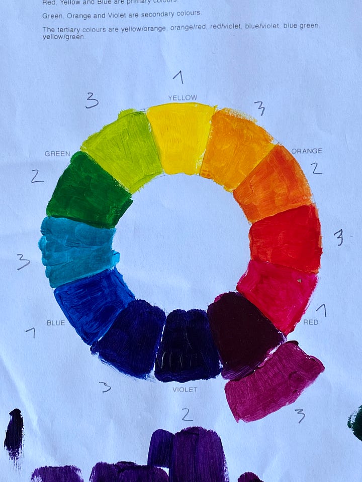
One of the assignments I enjoyed the most in art school last June was learning about the colour wheel and how to mix colour. I must admit pure blue is not one of my favourite colours. Possibly, it is the hue of the colour spectrum I feel the least attracted to. But I tend to use light blue to sketch drafts and I love a dark blue pen for drawing. And who doesn’t like a bright blue sky?


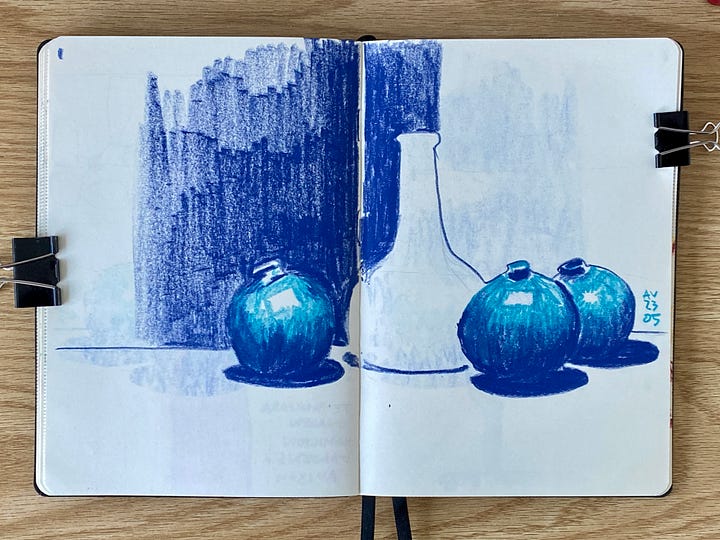
Colour wheel I did in art school and still life in blue testing some crayons Colour per se is forever deceiving: the way we perceive a specific colour depends entirely on the relationship between the adjacent colours. Joseph Albers puts it nicely: “We almost never (that is without special devices) see a single colour unconnected and unrelated to other colours. Colours present themselves in continuous flux, constantly related to changing neighbours and changing conditions. (…) For the reading of art: what counts is not the what but the how.”
Look at colours in pairs or groups. If you happen to like a specific blue (distant or not), pay attention to the surrounding colours and how they relate.
Orange and blue are a great couple - complementary colours work so well together. There is a whole vast body of colour theory behind why we feel attracted to complementary hues. But no theory reveals this better than looking at Vincent’s pictures. He was a master in using complementary colours, especially blues paired with oranges/yellows. In his Tree Roots, he truly achieved mastery.
I encourage you all to notice the distant blue mountains and reflect on what the colour blue evokes in you. If you are an artist, it would be great to hear about your thoughts and experiments with this colour in the comments below.
Regardless, simply enjoy the beauty of a life full of colours. Also, full of blues.
✏️✨
Happy sketching!
Ana


I love the choice of paintings you included here to illustrate your ideas on blue. It's funny, but I've been attending a few sketching classes recently and have taken a variety of blue felt tips to use rather than a pencil. I rather like the bold colour. Even if my drawings are a bit naff, the colour makes the page sing!