


✏️ Colour, Sun and Shadow
Quick and powerful sketches using a reduced colour palette

📖 The Quote
‘Shadow is a colour as light is, but less brilliant; light and shadow are only the relation of two tones.’ - Paul Cézanne
✏️ The Sketch
Step 1. Choose the view, image, building or space you’d like to depict.
This might influence your choice of colour. Whether you are urban sketching or drawing from a photograph, pay attention to the atmosphere of the scene:
Is it an overcast day? Then, there will be no shadows and very low light.
Is it raining a lot? Then, it will probably be very dark.
Is it a strong sunny summer day? Then, there will be a high contrast between highlights and shadows.
Is it a sunset or a sunrise? Then, the light will have a very particular colour.
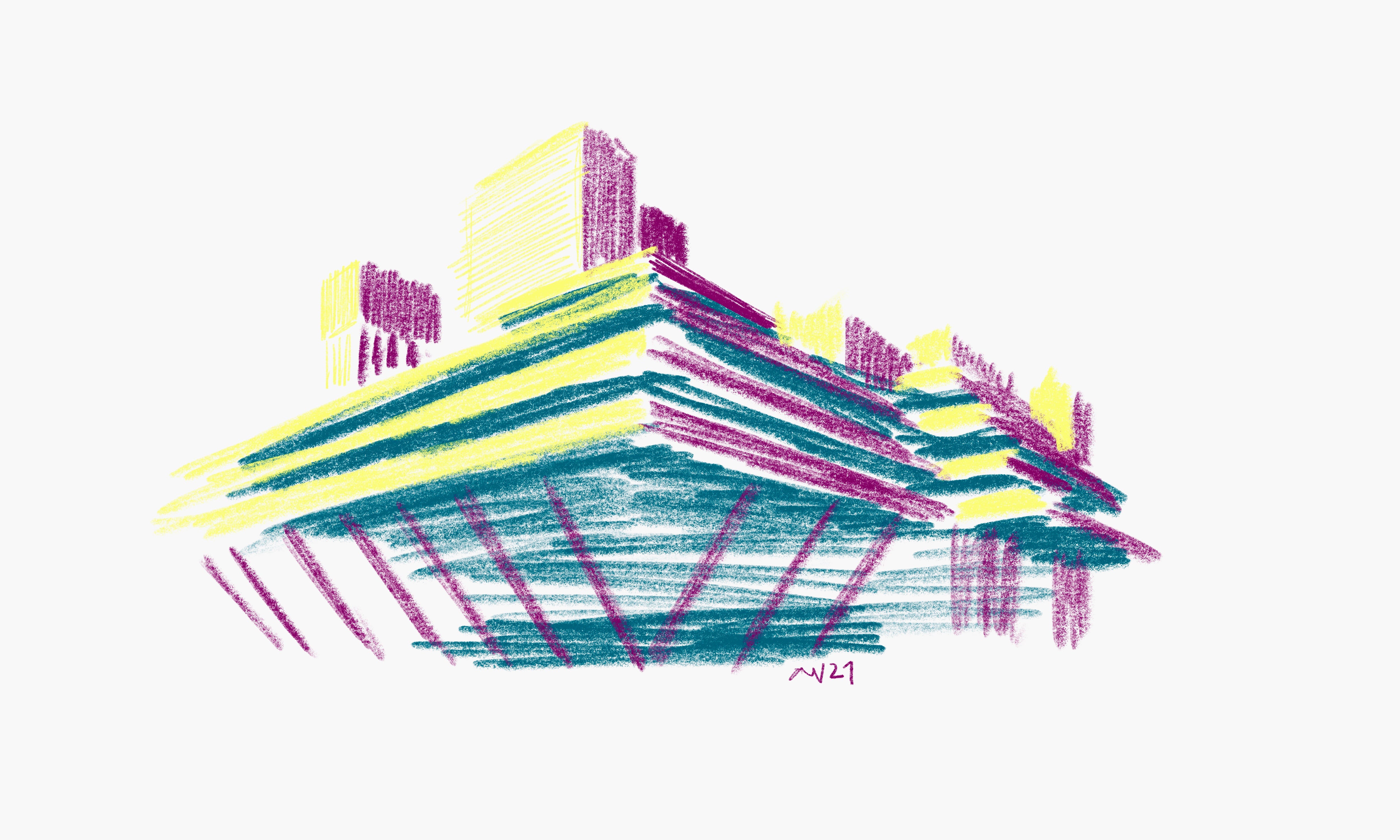
Step 2. Pick the three colours: one to depict highlights, the other for the mid-tones, and the last one for the shadows. You can:
Pick these three colours based on your previous observations of the scene. But remember: a grey day does not necessarily make a grey drawing. Rather than translating colour in a literal way, it is more interesting to translate the relations between those three colours.
For example, in my sketch, I am using complementary colours because I’d like to illustrate the high contrast between light and shadow, which also helps me to deepen the volume of this brutalist building.
On a shadowless day, you could also choose any hue (let’s say three not very dissimilar reds, for example) to convey the continuity of light levels.
Make your own rules! Choose the colours as you wish to explore, study and apply them to your sketches.
Step 3. Sketch!
My recommendation is always to test and explore different approaches and colours.
💡 Some Thoughts
Colour is not only a powerful tool to convey information and emotions, but it is also a great tool to analyse, understand, and learn about the world around us.
I am personally a massive fan of using very few but meaningful colours in pictures.
In design, you can use the previous sketch exercise to quickly assess light, colour and material in facade studies and buildings, and how these integrate within an existing context (whether urban or rural) with specific climate conditions (colour, sun and shadow). If you are an artist, working with a constrained colour palette is another way to study and depict light, as opposed to monochrome sketches or literal representations of colour.
🖼 The Artist
Peter Zumthor uses colour in his sketches to explore and depict light and atmospheric conditions. The set of sketches of the Thermal Vals and the Swiss Pavilion are good examples of this. We can immediately read in these plans what’s water and what’s a thick wall, and where the light is coming from, respectively.
I strongly recommend his book ‘Atmospheres’, where he reveals his processes and observations when designing a building. Zumthor goes beyond simply responding to technical architectural issues into conceiving spaces that relate to his own intimate and sensible understanding of the world: in this book he reflects on materiality, light, atmosphere, music, books...
💫✏️
Happy sketching!
Ana
Have you tried this week’s sketch? It would be great to hear about it! Please, leave a comment and share your thoughts down below :)